A Figma Library for Design Documentation
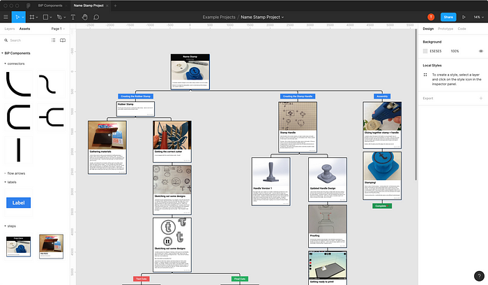
One of my dissertation projects when I was a graduate student at the MIT Media Lab was Build in Progress, a documentation platform and online community for sharing DIY projects.
A main focus of Build in Progress was developing a tool that lets people visualize and navigate process-oriented documentation, or documentation that shares iterations throughout the course of a design project. Build in Progress was meant for sharing stories around how a project evolves over time rather than instructions for building a project, a more dominant form of project documentation in the DIY community (e.g., Instructables).
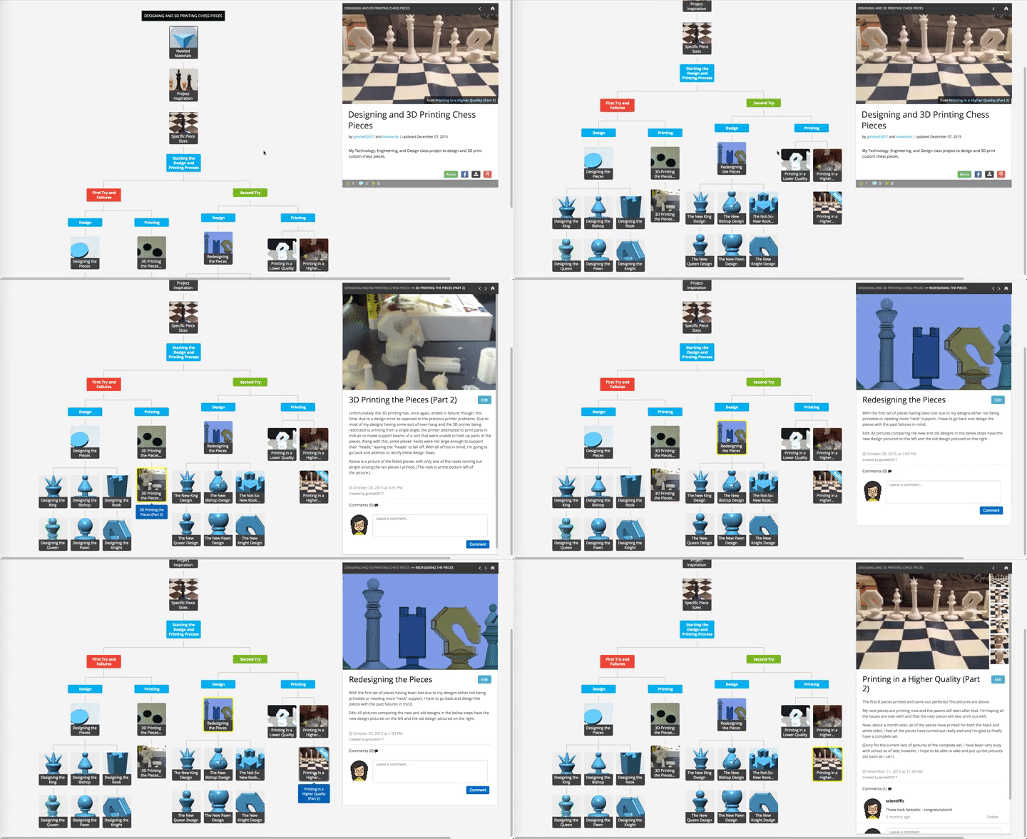
Build in Progress evolved over the course of approximately 2.5 years (documented pretty thoroughly on the platform itself here), and I partnered with many different schools, after-school programs, and independent makers who used the platform to document their projects (a blog post on that here).
A huge challenge for me after I graduated was figuring out what to do with the site, which had grown to support over 2,000 projects and users. At the Media Lab, there was a mantra of “deploy or die,” with the idea that projects from the lab should be shared in a way that enables larger public discussion and use. While I think the intention is good, “deploy or die” is not a great goal if there isn’t support (logistically, financially, etc.) for students to continue supporting the users who have dedicated time and effort to using these deployed platforms after the student graduates, which I quickly found out. I was paying $100s of dollars in Heroku and AWS fees out of pocket before I was able to collaborate with IT at the lab to host a static copy of the site.
I’m really thankful that someone from NECSYS was able to dedicate time to helping me create the static copy of the site, but it involved a lot of work that was not particularly accessible to me, which means the static build currently visible at buildinprogress.com is missing much of its original functionality and has lots of formatting issues that resulted from the translation process, things I don’t feel particularly empowered to fix without learning a lot about LAMP stacks.
Anyway, that entire process made me very hesitant to build any other platforms I didn’t feel I could support long term. I felt very guilty that people had devoted energy to training and using tools I built but then I didn’t have the money to pay to maintain. That encouraged me to work for companies for a few years after I graduated where I could learn more about how to build product at scale.
Since shutting down Build in Progress 4 years ago, I haven’t really found any design documentation platforms that support the same design goals.
I recently had a conversation with Yusuf Ahmad, a graduate student in my former research group, whose thesis is exploring alternative representations of documentation for a range of applications, including project documentation and workshop tutorials / guidelines. Our conversation made me think more about what it would be like to reuse an existing platform that could support the creation of process-oriented documentation.
Figma, a popular user-interface design tool, seemed like a solid choice given some of its built-in capabilities:
- a shared library system
- multi-user collaboration built in
- the ability to send links to projects that can be viewable in any browser
- a commenting system with notifications
- a freefrom editor that enables arguably much more flexibility in terms of visual representation
However, as a professional design tool, Figma is also quite complex and can be intimidating for new users, especially those not coming with experience using design tools like Sketch or Adobe XD (all popular tools among professional UX designers).
So I decided to try out building a set of Figma Components to see if I could recreate the Build in Progress experience using a mostly free, well-supported design tool that I would not ultimately need to maintain to the same extent that I did for Build in Progress.
The Figma Library
I started by translating a reasonably complex project from Build in Progress: one I created around designing a rubber name stamp.
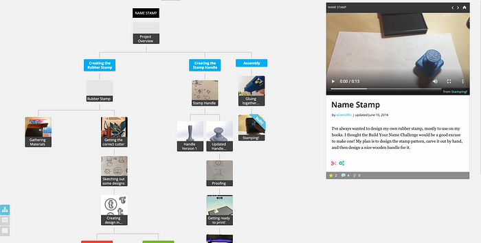
Figma is mostly used for static mockups, so it doesn’t enable the same interaction that was built into the design of Build in Progress; as an example, you can’t embed media like videos directly, and the Process Map, or visualization of steps visible on the left of any project page on Build in Progress, is not easily replicable as navigation UI.
Instead, I tried to just replicate the flow of the Process Map where the documentation (image and text) of each step is embedded in the map itself. You can see the result of the Figma-built documentation below:
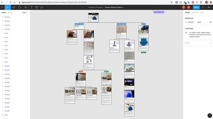
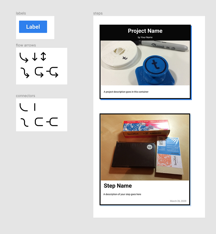
The component library I built consists of just a few elements:
- Two types of steps: an Overview for displaying an overview of the project (the root of the Process Map), and a regular Step for embedding images and descriptions of individual steps in a project.
- A label used to label branches in a Process Map
- Arrows & Connectors for connecting steps
I found out while prototyping that Figma only allows the use of Component libraries if you have a paid account or a student account. I was able to register for a student account using my University of Tokyo email address, but if you register, it’s $12/month.
You can point any new project to a Component Library to reuse elements from it. This is really convenient because if any changes are published to the Component Library, then you can merge in those changes into your project seamlessly.
Using the Auto-layout feature in Figma, I designed the components to automatically expand based on the size of the content:
The connectors are also designed so that the bends stay proportional so you can stretch them as far as you need to to accommodate the size of your Process Map.
Figma enables any project to be sharable, and any users with a Figma account can embed comments directly into the project. Using this feature is nice because users can leave comments anywhere in the project, and there’s a built-in notification system that will send you an email if a comments is left on your project.
Some Reflections
In the process of copying an example project over to Figma, I realized there are several things to still figure out:
- Is there a good way to embed time-based navigation? With Build in Progress, there were back and forth arrows to navigate the steps in a project based on chronology as well as the spatial representation of the Process Map (by clicking on the individual steps). I might be able to replicate some of this behavior using Figma’s prototyping UI.
- It would be nice to figure out a good component that can accommodate multiple photographs in a step. I think Autolayout can support replicating multiple nested components, so I could try to create a nested component for an image + description combo.
- The nice thing about Figma is that it’s a very powerful design tool, so I could design components that would be more difficult / impossible to implement in HTML & CSS on the web. Still need to figure out what those components might be!
Try it Out
I’d love for anyone that used to use Build in Progress to try this out and see if it achieves most of the original goals of the platform!
Leave a comment on this post if you’d like to try out the Figma Build in Progress component library.
Because I created a student team, you need to have an education / student account with Figma to be added as a member. Once you’re a member of the team, you can create a project that uses the component library.
Thanks for reading!
